Camaléon
- Logo, Naming & Brand Identity
- Packaging
- Below the line
- Website
- Photo Shooting & Post Production
- Totem Display
Light is, by definition, ever-changing—and with a new-generation recessed spotlight, sustainable both environmentally and economically, it becomes even more so: installable in any hole without masonry work, with unlimited possibilities for changing the decorative elements. Our task was to promote it to architects and designers by creating a name, logo, and brand identity, as well as developing other communication tools and actions.
The choice of name falls on Camaléon, signifying the great versatility of the solution, an element that returns in the payoff “Light transforms”. Elegant solutions that tell of a new way of modelling light, reaffirmed by a visual identity inspired by a minimalist design with captivating chromatic balances. A language in full harmony with the aesthetic codes of the target audience.
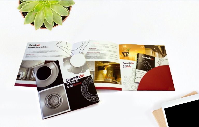
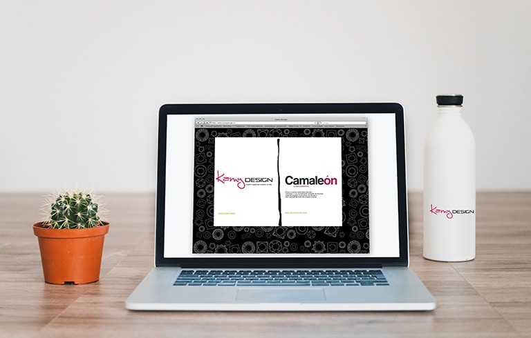
Minimalism and the harmony of black and white contrasts return in the other instruments: from the refined product packaging, to the presentation and in-depth materials, including brochures, folders and catalogues, continuing with the elegant point-of-sale displays, to the website, designed to translate the sophistication of a contemporary style with great communicative depth into digital.
![]()
Absolut
Eventi&Comunicazione
Via Cesare Battisti, 11 – 40123 Bologna
 absolutagenzia
 Absolut – eventi&comunicazione
 @AbsolutEventiComunicazione
© 2025 Comunicare Green. Copyright @ 2020 Absolut | P.IVA 02133751202
